Post by Kurai on Jul 1, 2011 8:42:32 GMT -5
First and foremost, I welcome these changes on a trial-basis, I think of maybe 2 weeks. Give it a whirl, if it's decided you guys don't like it or want some element of it changing (as per popular vote) that can be done!
Other than the obvious aesthetics, the following changes are:
1. New Skin
This Skin is saved as "Righters Untie V4". The skin refers to the colours and whatnot, although it does not refer to the hard-coded stuff (such as the central alignment of the forum). You can change skins through your profile settings. "Righters Untie V1" refers to the blue skin we all know and love. "Righters Untie V2.MG" refers to the "Maggie Grace" skin (lol) and "Righters Untie V3" refers to a beige skin.

2. New Logo
The logo currently only matches the original Righters Untie V1 skin. If after the trial it is decided that the new skin is good enough, I will probably change the colour of the new logo so that it matches better, but until that time I'll keep it as it is.
3. Explore RUN
This refers to the new links at the top of the forum. They provide direct links to the different sub-boards within RUN.

Simply click on a link and it'll take you straight to the sub-board!
4. New Welcome Table

This replaces the news fader. The left-hand column can be updated (by those with appropriate powers) with news and announcements. The right-hand side welcomes the user to our forum. The bar underneath displays currently featured shows, and is updated with the latest reviews so you can see which shows have been reviewed!
5. Central Alignment
By this I mean the fact that the forum is now "squished", rather than being previously "stretched". This is hard-coded and is therefore currently affecting all skins. In my opinion I think it makes things look much neater, but the primary reason is because of how well it fits into the new skin design. However, at the end of the trial period we can see how you guys judge.
6. Colour Scheme
Getting colours right is tricky... See how much you like it and feel free to suggest colours that could be changed or whatnot.
7. Information Centre
This is what displays the forum's statistics at the bottom of the forum. In my opinion, it's a nicer layout (that doesn't take up as much space)

8. New Smilies and Icons
All of the icons on the forum, including the smilies, have been updated. These are not icons I have designed, rather they are the official new proboards icons that were updated automatically when I created the new skin, so if you don't particularly like them I'm afraid we might be stuck with them anyway.
9. Stickied and "Completed"
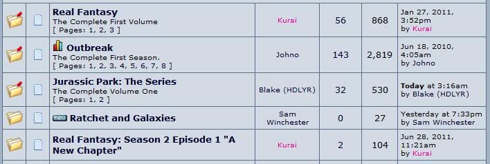
Going off the suggestion that all completed seasons be moved into the "Full Seasons" sub-board, which I think is still up for debate at the moment as it hasn't been done, I have temporarily organised all Full Seasons within each sub-board and made them all "sticky" so that they appear (in order) at the top of each sub-board. Notice how "The Complete First Season" text now appears underneath...

10. Topic Description
You can now add a description that appears underneath your topic title. For example "The Complete First Season". This is easy enough to do... When you're creating a new topic, there will be an area for you to enter the Subject (e.g. "Providence") and then the Description (e.g. "Episode 1"). You don't have to do this of course! If you want to change your description, you simply modify the first post of the topic (just like you would anyway).


(shameless plug^^)
Please note that the Topic Description is limited to 50 characters only! I have tried my best to increase this but unfortunately can't >.<
Other than the obvious aesthetics, the following changes are:
1. New Skin
This Skin is saved as "Righters Untie V4". The skin refers to the colours and whatnot, although it does not refer to the hard-coded stuff (such as the central alignment of the forum). You can change skins through your profile settings. "Righters Untie V1" refers to the blue skin we all know and love. "Righters Untie V2.MG" refers to the "Maggie Grace" skin (lol) and "Righters Untie V3" refers to a beige skin.

2. New Logo
The logo currently only matches the original Righters Untie V1 skin. If after the trial it is decided that the new skin is good enough, I will probably change the colour of the new logo so that it matches better, but until that time I'll keep it as it is.
3. Explore RUN
This refers to the new links at the top of the forum. They provide direct links to the different sub-boards within RUN.

Simply click on a link and it'll take you straight to the sub-board!
4. New Welcome Table

This replaces the news fader. The left-hand column can be updated (by those with appropriate powers) with news and announcements. The right-hand side welcomes the user to our forum. The bar underneath displays currently featured shows, and is updated with the latest reviews so you can see which shows have been reviewed!
5. Central Alignment
By this I mean the fact that the forum is now "squished", rather than being previously "stretched". This is hard-coded and is therefore currently affecting all skins. In my opinion I think it makes things look much neater, but the primary reason is because of how well it fits into the new skin design. However, at the end of the trial period we can see how you guys judge.
6. Colour Scheme
Getting colours right is tricky... See how much you like it and feel free to suggest colours that could be changed or whatnot.
7. Information Centre
This is what displays the forum's statistics at the bottom of the forum. In my opinion, it's a nicer layout (that doesn't take up as much space)

8. New Smilies and Icons
All of the icons on the forum, including the smilies, have been updated. These are not icons I have designed, rather they are the official new proboards icons that were updated automatically when I created the new skin, so if you don't particularly like them I'm afraid we might be stuck with them anyway.
9. Stickied and "Completed"
Going off the suggestion that all completed seasons be moved into the "Full Seasons" sub-board, which I think is still up for debate at the moment as it hasn't been done, I have temporarily organised all Full Seasons within each sub-board and made them all "sticky" so that they appear (in order) at the top of each sub-board. Notice how "The Complete First Season" text now appears underneath...

10. Topic Description
You can now add a description that appears underneath your topic title. For example "The Complete First Season". This is easy enough to do... When you're creating a new topic, there will be an area for you to enter the Subject (e.g. "Providence") and then the Description (e.g. "Episode 1"). You don't have to do this of course! If you want to change your description, you simply modify the first post of the topic (just like you would anyway).


(shameless plug^^)
Please note that the Topic Description is limited to 50 characters only! I have tried my best to increase this but unfortunately can't >.<


